NYECC
UX/UI Design | WeB Design
A better experience for new members
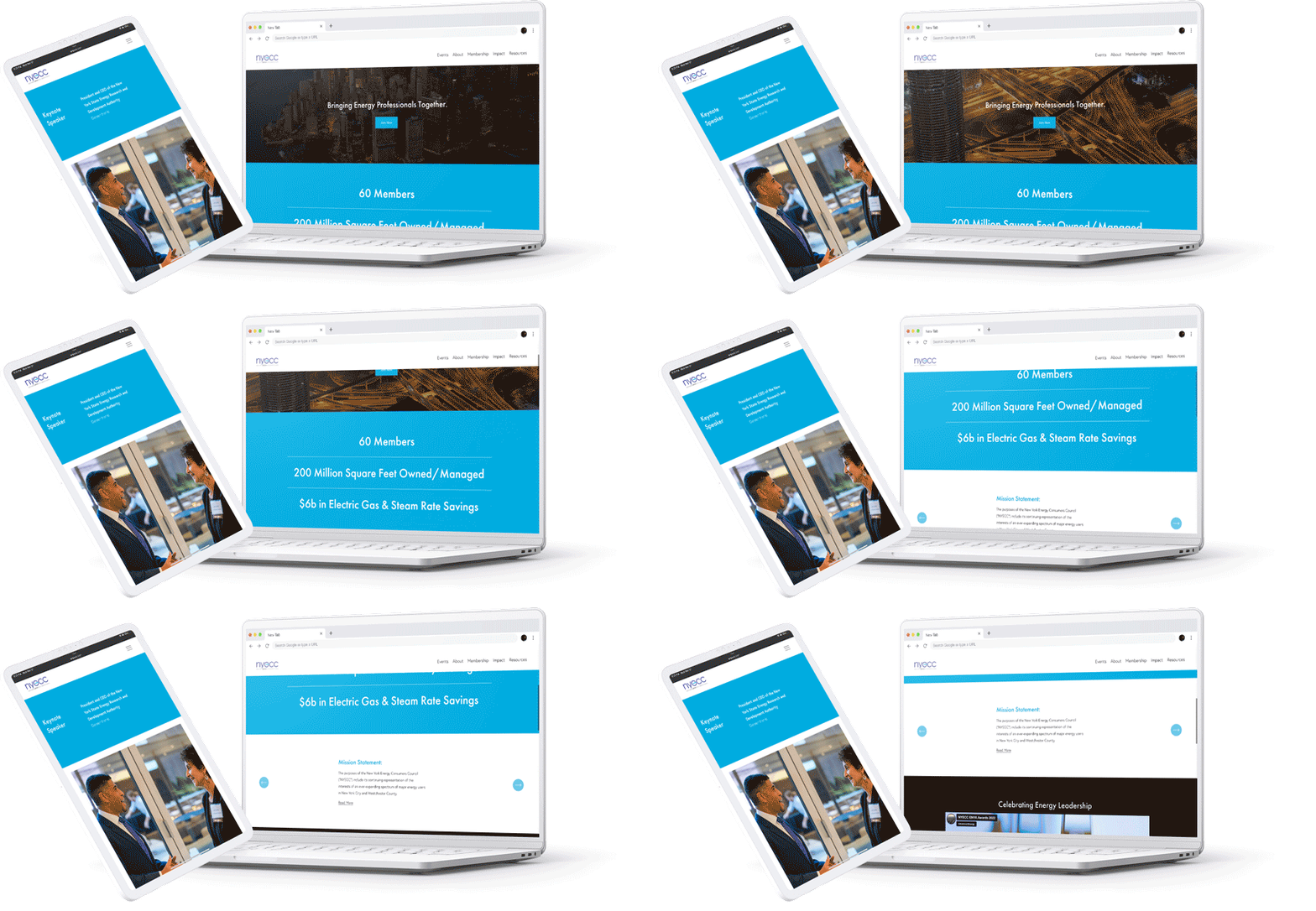
NYECC’s website left potential new members confused- there were too many menu items & it wasn’t clear how new members could sign up. I crafted a new website which fixed those pain points and offered a smoother user experience overall.
The Problem
The Solution
The NYECC website lacked a clear structure, the menus were long and hard to understand and it was not generating new member sign ups.
After digging into some cursory analytics, I created a sitemap, simplified the menu, restructured the homepage to highlight the call to action and gave the website an overall face lift. The result was an easy to use website with a lower bounce rate, more sign ups and a happy client!


